Design Psychology for Your Link in Bio: Colors, Layouts, and Copy That Convert
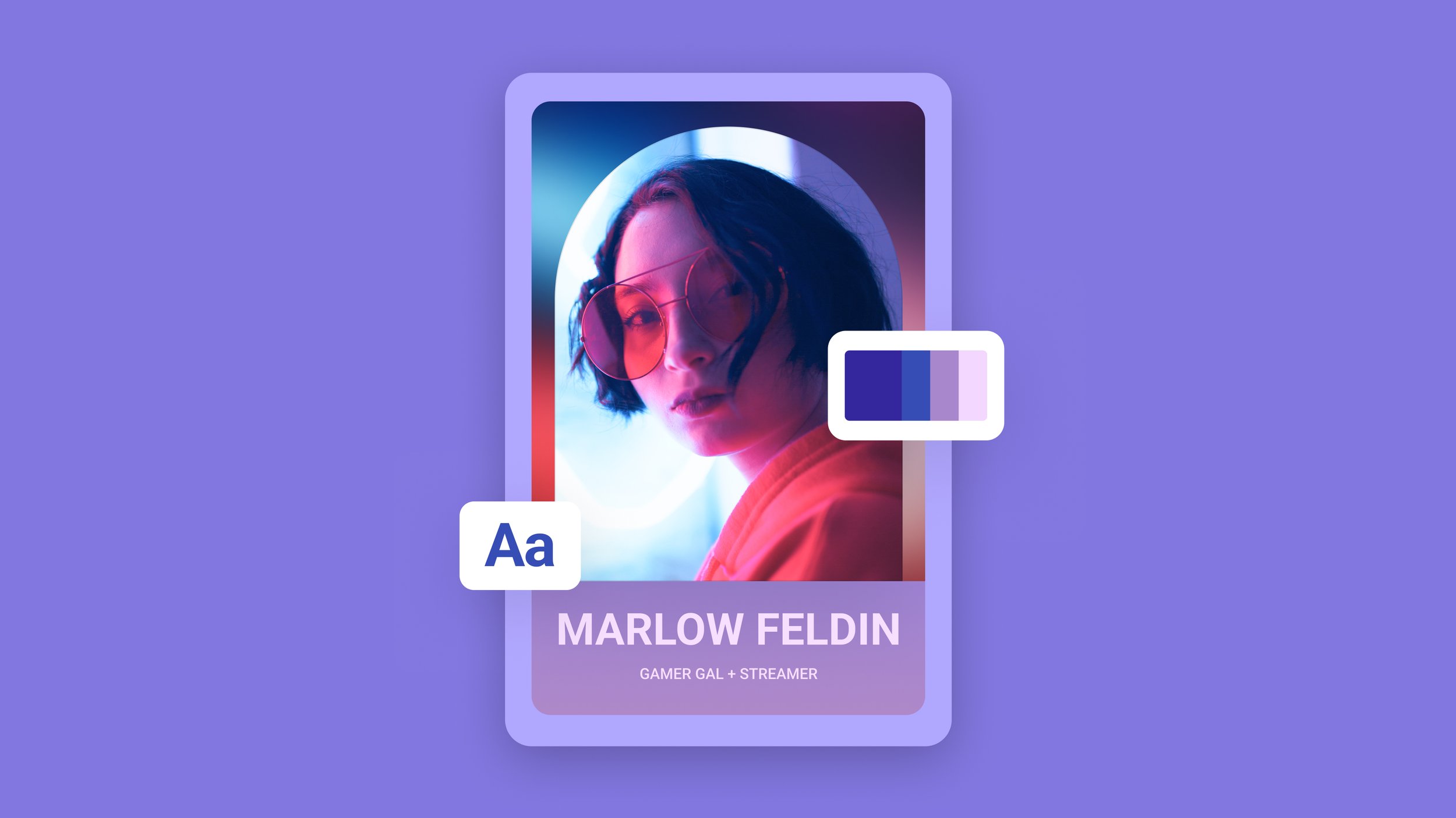
Design is more than “making it pretty.” On a Bio Site, design is how you guide attention, signal trust, and prompt action — all in a few seconds on a small mobile screen.
Here’s how to use simple design psychology to turn more visitors into buyers, subscribers, and clients.
Principle 1: One Visual Focal Point Above the Fold
When someone taps your link in bio, the top of your page should answer:
What is this?
Who is it for?
What should I do first?
Use:
A high‑quality hero image or brand graphic
A short, bold headline (“Learn how to triple your freelance income in 6 months”)
A single, clear button (e.g., “Get the free roadmap”)
Avoid stacking multiple equal‑weight buttons here — it creates decision fatigue.
Principle 2: Use Color Intentionally, Not Randomly
Color cues attention and emotion.
Use your brand palette for backgrounds, section headers, and accents
Reserve your brightest accent color for your most important buttons
Keep secondary links in more neutral tones so they don’t compete
If everything is loud, nothing is.
Principle 3: Align Layout to Your Primary Goal
Your layout should visually reflect your #1 objective:
Selling digital products? Put your top product block front and center with a strong image and social proof.
Booking clients? Lead with a simple explanation of your offer and a clearly labeled appointments block.
Growing your email list? Make the mailing list section feel like a featured “offer,” not a tiny form buried below.
On a Bio Site, hierarchy = priority.
Principle 4: Write Button Copy That Finishes the Sentence “I want to…”
Button text is tiny, but powerful.
Replace vague copy like:
“Click here”
“Learn more”
with specific, benefit‑oriented actions:
“Start the 7‑day challenge”
“Download the pricing guide”
“Book your strategy session”
This lowers friction because visitors know exactly what happens when they tap.
Principle 5: Add Micro Copy Where Doubt Creeps In
Whenever you ask for money or personal info, address the question in their head.
Examples:
Under a pricing block: “One‑time payment. Lifetime access.”
Near a form: “No spam. Unsubscribe anytime.”
Next to a tip jar: “Tips are optional but deeply appreciated.”
A single reassuring line can dramatically increase conversions.
Principle 6: Test One Design Change at a Time
You don’t need a full rebrand to see improvement.
Try:
Moving your main offer above the fold for a month
Changing just your CTA color and tracking clicks
Testing two headline variations that describe the same offer
Small tweaks, measured over time, add up to big wins.
Design Your Bio Site Like a Conversion Pro
A beautiful link in bio that doesn’t convert is just decoration.A well‑designed Bio Site turns attention into action.
Use Bio Sites to quickly experiment with layouts, colors, and copy — until your design is working as hard as your content.
